
What 51 years of data says about silver
There has been a lot of talk about silver lately, mostly because it has decided to go absolutely vertical over the past twelve months. Whenever that happens, the internet immediately fills up with explanations. Geopolitics. Central banks. Supply shortages. Monetary collapse. Industrial demand. Spiritual awakening. You name it.
Instead of getting into a debate about which of these stories is the real one, I wanted to ask a much simpler and much more boring question.
Over a really long time, what has the metal delivered?
So I went and pulled monthly silver futures data going all the way back to 1975 and just let the numbers speak.
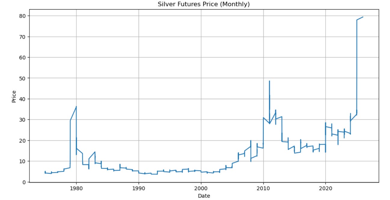
The annualized return over those 51 years comes out to about 5.94% in USD. That sounds neat and tidy, but it doesn’t tell the full story. It takes more than half a century of market chaos and compresses it into a single number, quietly skipping over what actually happens along the way.
Because along the way, silver can be… difficult.
There are long stretches, sometimes entire decades, when it does basically nothing. And then there are years like the last one, where if you happened to be holding silver, you more than doubled your money. Depending entirely on when you invested, the experience could have felt boring, frustrating, euphoric, or all three in rapid succession.
To understand what owning silver has really been like, it makes far more sense to stop looking at one big number and start looking at rolling returns.
Rolling returns are basically the market equivalent of asking, “Okay, but what if I had started at a different time?” Imagine taking a one year investing window and sliding it across history one month at a time. Start in January 1975, hold for one year, note the return. Then start in February 1975, hold for one year, note the return. Then March 1975. And so on, month by month, through fifty one years of market history. Instead of getting one clean answer, you get hundreds of answers, each representing what a real investor could have experienced depending on when they jumped in. Some of those investors look like geniuses at dinner parties, some of them quietly question their life choices, and all of them end up with very different outcomes despite investing in the exact same asset. Rolling returns turn long term performance from a single tidy number into a messy but honest picture of what actually happened.
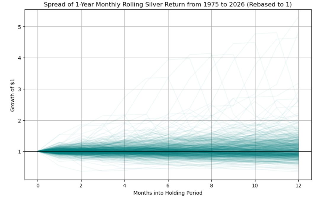
And once we have all these hypothetical investors lined up, some lucky, some unlucky, we can start to make sense of the chaos. By looking at medians and quartiles, we get a picture of what a normal journey looked like for someone holding the asset instead of obsessing over the extreme winners or losers.
So let’s start with one-year rolling returns.
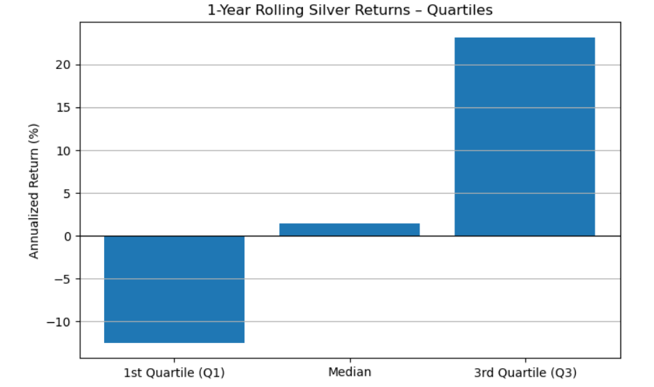
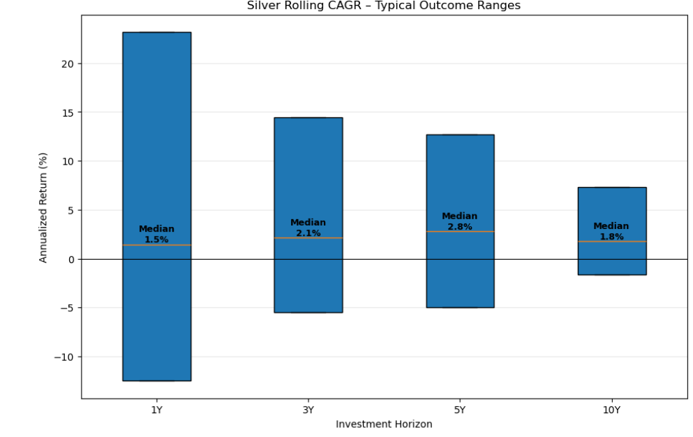
Anywhere between -12.49% and 23.16% is not out of the ordinary, if we are looking at a 1 year investment horizon. The median is 1.46%. I now look at the same thing across 3, 5 and 10 year investment horizons.
A few things immediately stand out.
If you are investing for 5 years, anywhere between -4.95% and 12.72% is not an unusual return.
A decade of no returns is not unusual for silver. (At least when we look at the last 50 years)
The range of outcomes predictably reduce as we increase the time horizon.
Lastly, I look at the probability that you made no money in silver, while still looking at rolling returns over the last fifty one years.
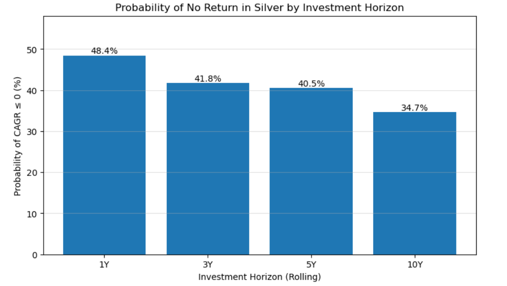
If you stare at that chart for long enough, one thing becomes painfully clear: silver has not been a “buy it, forget it, and go live your life” asset.
Silver has been more like that friend who is occasionally brilliant, frequently difficult, and sometimes disappears for a decade. That alone should inject a healthy dose of caution into any “silver always wins in the long run” story. Timing, cycles, and macro regimes seem to matter a lot here.
And yet.
What makes this moment uncomfortable in a good way is that the past year does not sit in the middle of history’s distribution. It is not close to the median. It sits well beyond the third quartile of past outcomes. That means something unusual is happening. Not unprecedented, but rare.
So when people start talking about monetary hedges, energy transitions, or silver finally “waking up,” they are not hallucinating. The data agrees that this kind of setup does not happen often. There is clearly some merit in the narratives and the numbers lining up at the same time.
But how should all of that translate into what silver is worth?
I wish I knew.
As always, thank you for reading. If you are looking for a similar analysis on gold you can head here.
Disclaimer This content is for informational purposes only and is not investment advice. While care has been taken to ensure accuracy, errors may exist. The author makes no guarantees and accepts no liability for decisions or outcomes based on this material.
Cover image taken from Unsplash